True Blue,
Pottery Barn
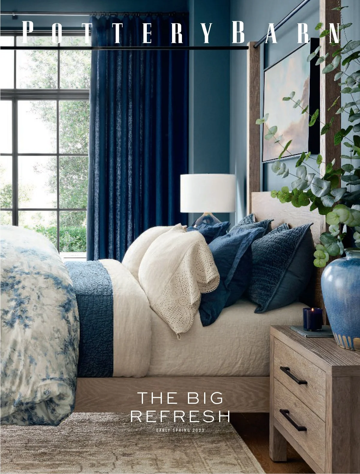
For Spring 2023, I art directed a campaign centered around "True Blue," a celebration of soulful shades of blue ranging from chambray to indigo. The campaign brought to life a mix of traditional toile, tile-inspired motifs, and casual knits, positioning blue as both a timeless accent and a layered statement. I translated that aesthetic across email, paid social, display banners, and native ads, anchoring the visual language in the homepage experience to create a cohesive, integrated campaign that drove strong customer engagement and conversion, contributing to one of Pottery Barn’s most successful seasons to date.
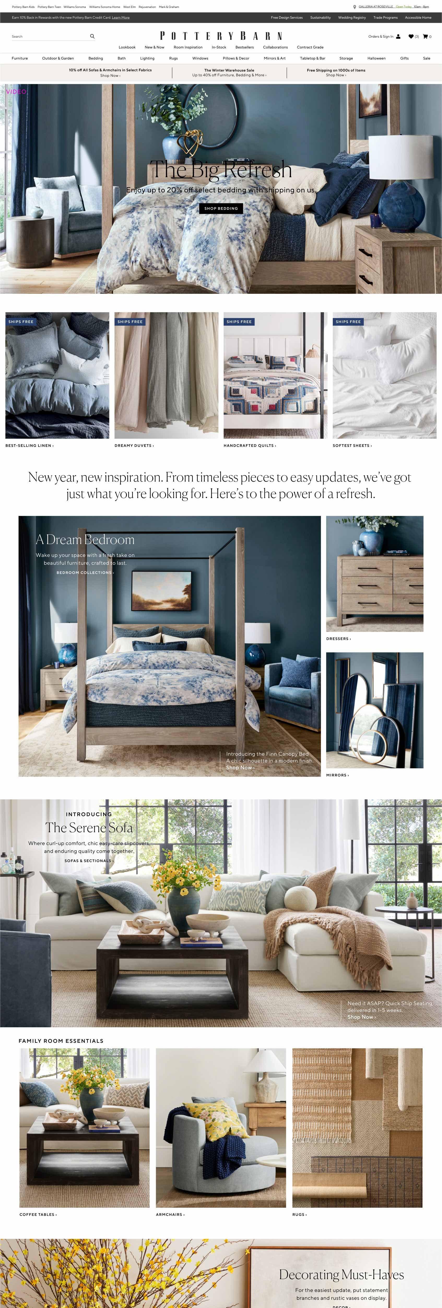
Homepage
The three emails below are a few examples from the Spring 2023 launch that weave in the True Blue theme. Each email serves a distinct purpose, building awareness and driving engagement across different customer needs.
Emails
Lookbook
The Spring Lookbook email serves as the seasonal opener, an introduction to the new looks, themes, and products designed to get customers excited and inspired about what’s new at Pottery Barn. For Spring 2023, the Lookbook anchored the season in the True Blue theme before broadening the story to include Decorating with Color and a Neutral Expression counterpoint, where soft woven textures and natural materials offered warmth and character for customers drawn to a quieter palette alongside the season’s bolder color story.

True Blue Throughout the Home
Bedding is one of Pottery Barn’s most important sales categories, making it the natural hero of this email and the perfect vehicle for introducing the True Blue palette to customers. From there, the email guides customers through the rest of the home room by room, from the bedroom to the family room to the dining room, showing how the season’s signature shades of blue could work as a unifying thread throughout every space.

Design Crew
Design Crew customers represent some of Pottery Barn’s highest-value shoppers, making consistent promotion of this free service a priority throughout the season. Each new launch is an opportunity to refresh the messaging with new imagery, and for Spring 2023 that meant weaving in the True Blue theme visually while the copy spoke directly to how Design Crew connects customers to complimentary in-store and virtual interior design support, a natural extension of the seasonal launch that transforms inspiration into action with expert guidance.

The social assets for this season kicked off with a True Blue post tied directly to the seasonal launch, followed by a second piece that broadened the color story, inviting customers to transform their space with Pottery Barn’s colorful decorating touches.
Social
As the season progressed, the social content shifted focus from the True Blue color story to product and lifestyle. One post introduced the Serene Sofa, highlighting its modern lines, exceptional comfort, and enduring quality. Another invited customers to reimagine their living space beyond four walls, pairing the headline “Picture Yourself Here” with beautiful outdoor settings featuring sofas, chairs, and dining tables, inspiring customers to extend their home into the outdoors.
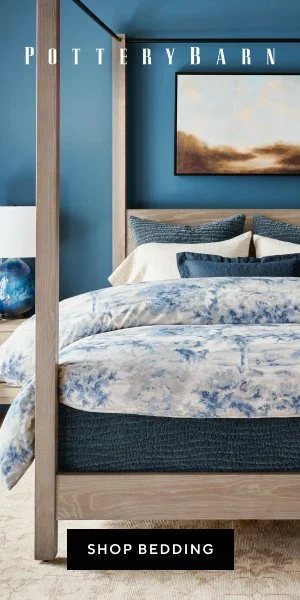
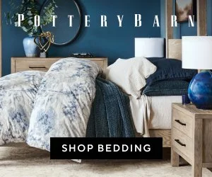
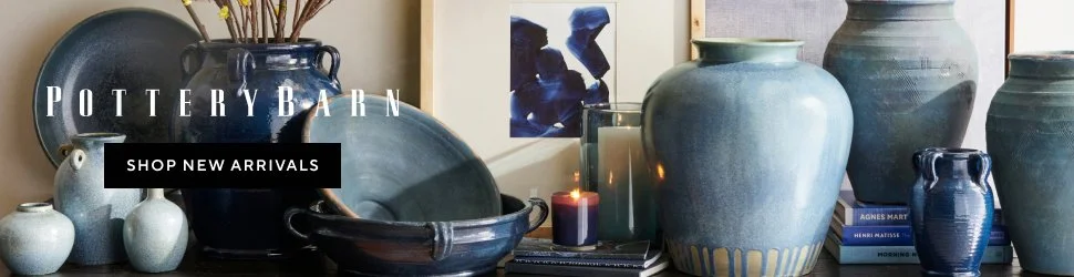
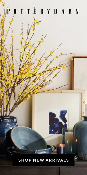
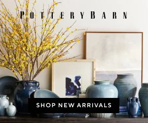
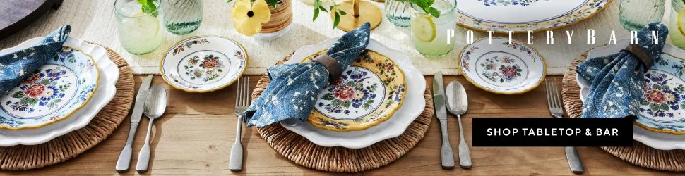
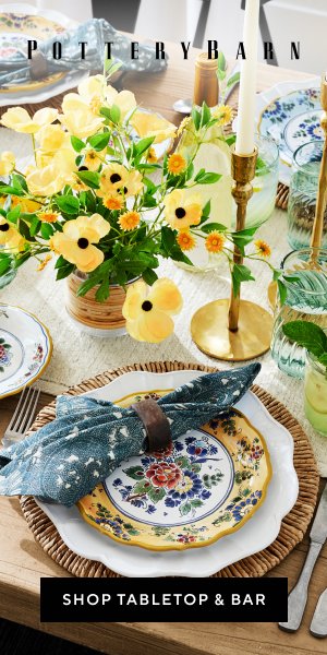
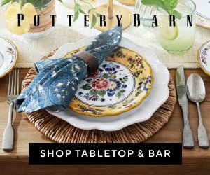
For the Spring 2023 season, my team produced ten sets of native and display ads spanning a range of product categories. Here, I’ve highlighted three ad sets that best represent how we wove the True Blue theme throughout the campaign: a bedding set and a new arrivals set that anchored the seasonal color story, and a tabletop set that carried forward the broader color celebration echoed in the social assets, tying the full campaign together across every digital touchpoint.
Native & Display Ads