RH Baby & Child
RH Baby & Child brings the RH sensibility in a smaller, sweeter package, offering tasteful furnishings for infants and children that reimagine nurseries, playrooms, sleep and study spaces. During my time at RH, I designed a series of email campaigns for this beloved brand, developing layouts that felt cohesive with the broader marketing channels while standing on their own as a premium brand experience. My work spanned multiple seasons, ensuring every deliverable reflected the seasonal vision and maintained the elevated aesthetic RH is known for.
Dream Spaces,
Brought to Life
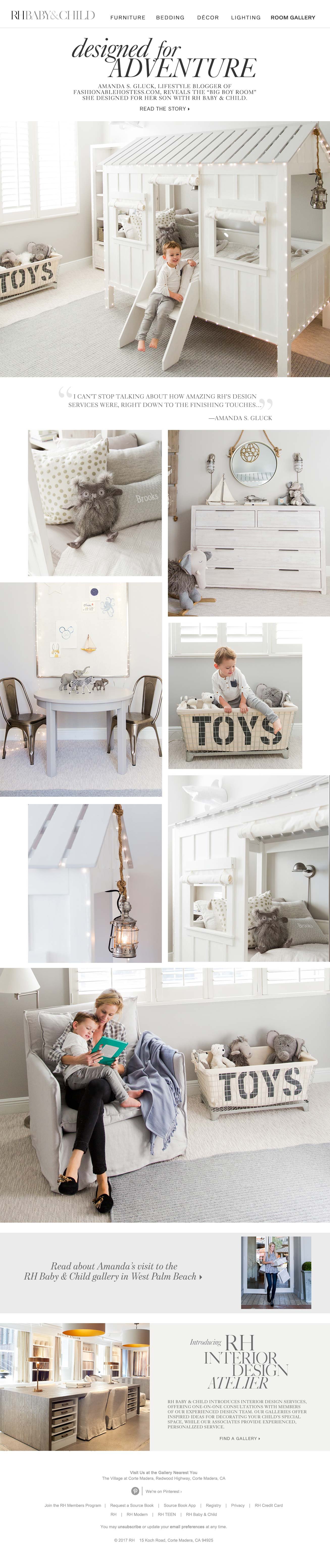
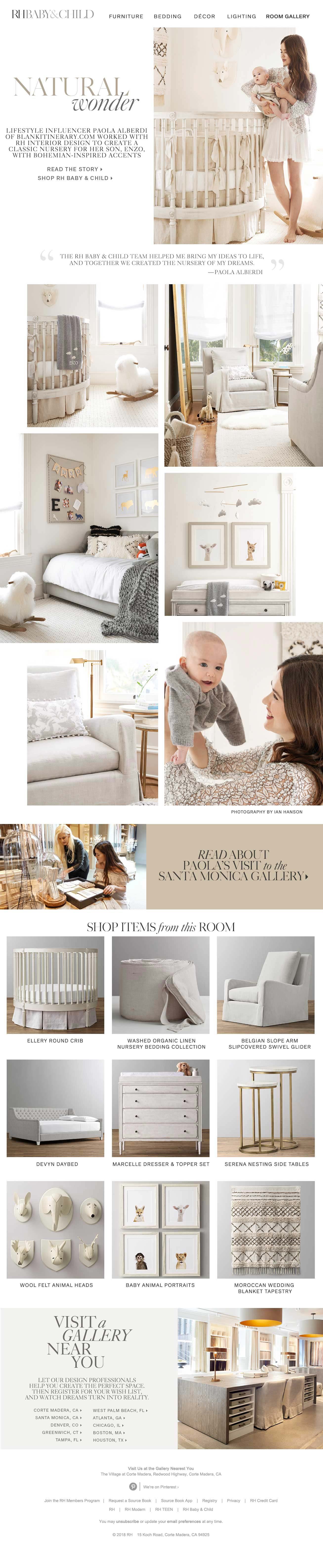
These two emails featured real customer stories, showcasing how RH Baby & Child’s design services helped families bring their dream spaces to life. Lifestyle blogger Amanda S. Gluck revealed the “big boy room” she created for her son, while lifestyle influencer Paola Alberdi shared the classic, bohemian-inspired nursery she designed for her infant son Enzo, both with the guidance of the RH Interior Design team. I designed layouts for each that balanced editorial storytelling with clean, shoppable product photography, weaving together lifestyle imagery, heartfelt customer quotes, and curated room detail shots. Varying image sizes aligned on a center axis created visual interest while maintaining the modern, uncluttered aesthetic RH Baby & Child is known for, with each email closing on a warm, intimate moment between mother and child in their beautifully designed space.

Design Your Dream Nursery
This email guided expectant and new parents through everything they need to create the perfect nursery, from classic crib silhouettes and softly washed bedding to gliders, lighting, and storage. Using large typographic numbers as a design device, the layout walked customers through nine curated categories in a clear, shoppable format. The result was an editorial yet functional email that made the nursery building process feel both inspiring and approachable.
Innocent Beginnings
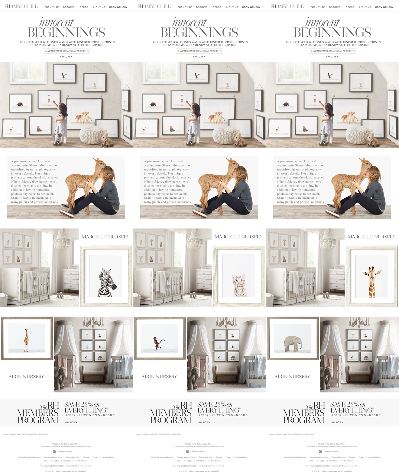
A collaboration with renowned animal photographer Sharon Montrose brought whimsical portraits of baby animals to nursery walls. I developed a layout that paired styled nursery photography with animation, placing animated GIFs alongside each room shot to cycle through the individual pieces of artwork, giving customers a close-up view of each print without leaving the email. This creative solution brought the collection to life in a way that made the experience more engaging.
A Handcrafted Classic
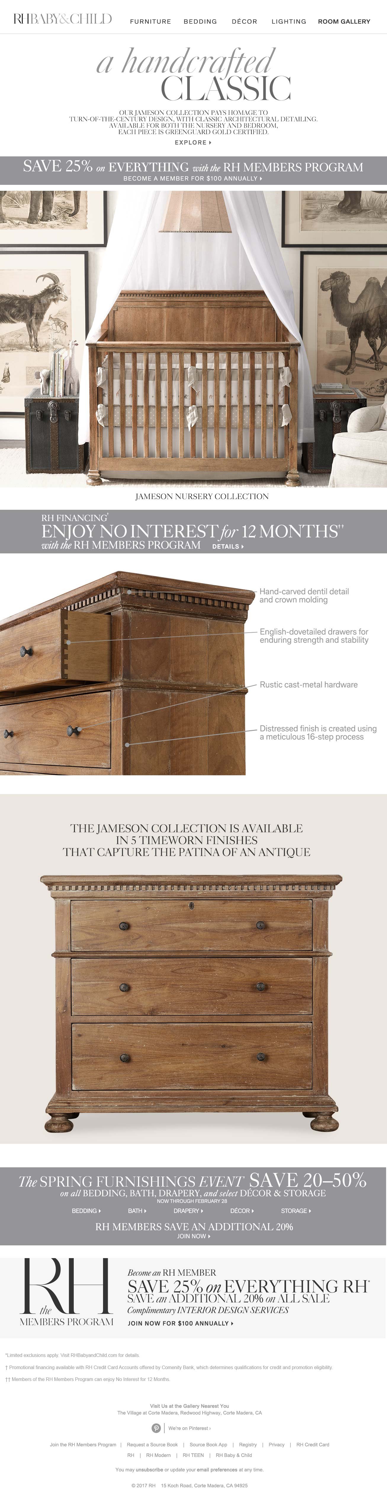
The Jamieson Collection email introduced a handcrafted nursery and bedroom line that pays homage to turn-of-century design. I designed a layout that told the craftsmanship story visually, opening with a inspiring nursery shot before moving into a detailed three-quarter view of the dresser. Annotation lines drew the customer’s eye to four key points of construction detail, from hand-carved molding to a meticulous 16-step distressed finish, before closing with a clean, head-on product shot highlighting the collection’s five available finishes. The result was an email that felt as considered and crafted as the furniture it showcased.
Introducing the
Cole Bunk Bed
This email introduced the Cole Bunk Bed, a design inspired by the simple A-shaped frame of an iconic American barn, transformed into a fairy-tale hideaway with the addition of a sheer tassel voile canopy. I led with a beautiful lifestyle shot of the bunk bed styled in a full bedroom setting, letting the product speak for itself before guiding customers through a curated selection of complementary pieces to complete the room, from bedding and dressers to rugs, wall art, and draperies, laid out in a clean, shoppable format.

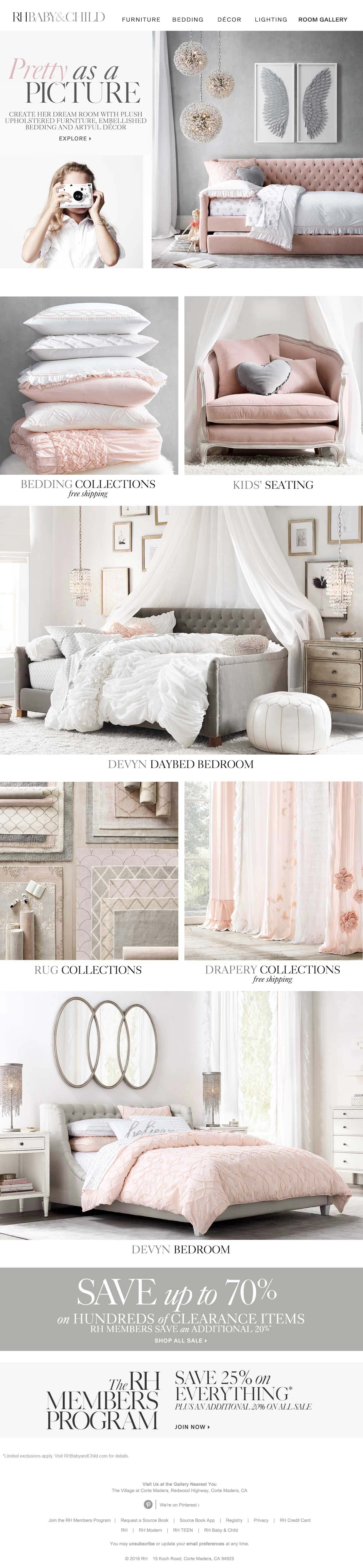
Pretty as a Picture
Inviting customers to create their child’s dream room with plush upholstered furniture, embellished bedding, and artful decor, I opened the layout with a charming lifestyle shot of a little girl mid-snapshot alongside a beautifully styled bedroom featuring an upholstered daybed and a set of sparkling pendant lights, setting an aspirational tone before moving into a clean product grid. The grid offered customers a series of shoppable doorways into the site across key categories, from bedding and kids’ seating to rug and drapery collections, anchored by two full-width feature images of the Devyn Bedroom that kept the room vision front and center throughout.